Approximately 96% of visitors that come to your website are not ready to make a booking. The aim of your website is to compel them to book a session and show them an easy way to become your client. Some website elements do this job better than others.
If your website isn’t working for you, it’s probably working against you. In this blog post, we dissect the average therapy website and describe what elements will bring you new clients.
Basic website elements
All the elements of a website interact with and complement each other. If you don’t have basic elements that work flawlessly, there’s little chance that users will stay on your site, let alone become your clients.
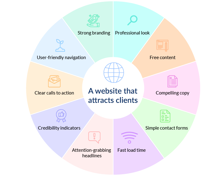
Let’s recall the basic website elements, their roles, and what they should look like.
Strong branding
Strong branding is a must if you want to catch your visitors’ attention and be remembered. Your website branding consists of your logo, name, color palette, media, website theme, and layout. All of these elements should look professional and be consistent. If you choose a palette of three colors, make sure there aren’t any elements of a different color. Keep your branding consistent across all channels (website, social media, advertising, etc.) so that your prospects recognize you every time they see you and make a booking with you.
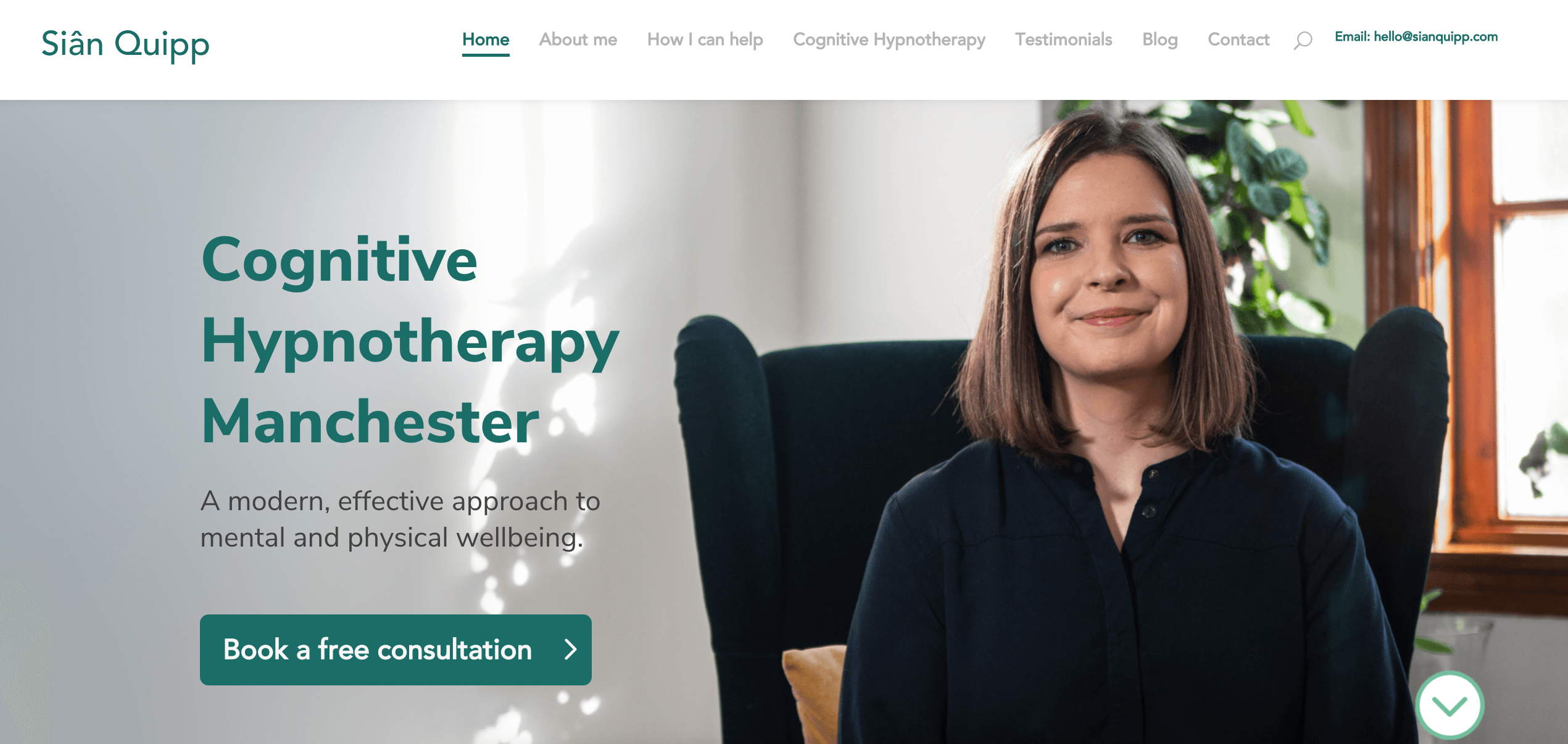
Check out the design and branding of the Siân Quipp website. Instead of a logo, there’s the name of the therapist, which is a good idea if you can’t come up with a logo design. The consistent use of color across website elements and photos makes this website a pleasant place to browse for cognitive hypnotherapy services.
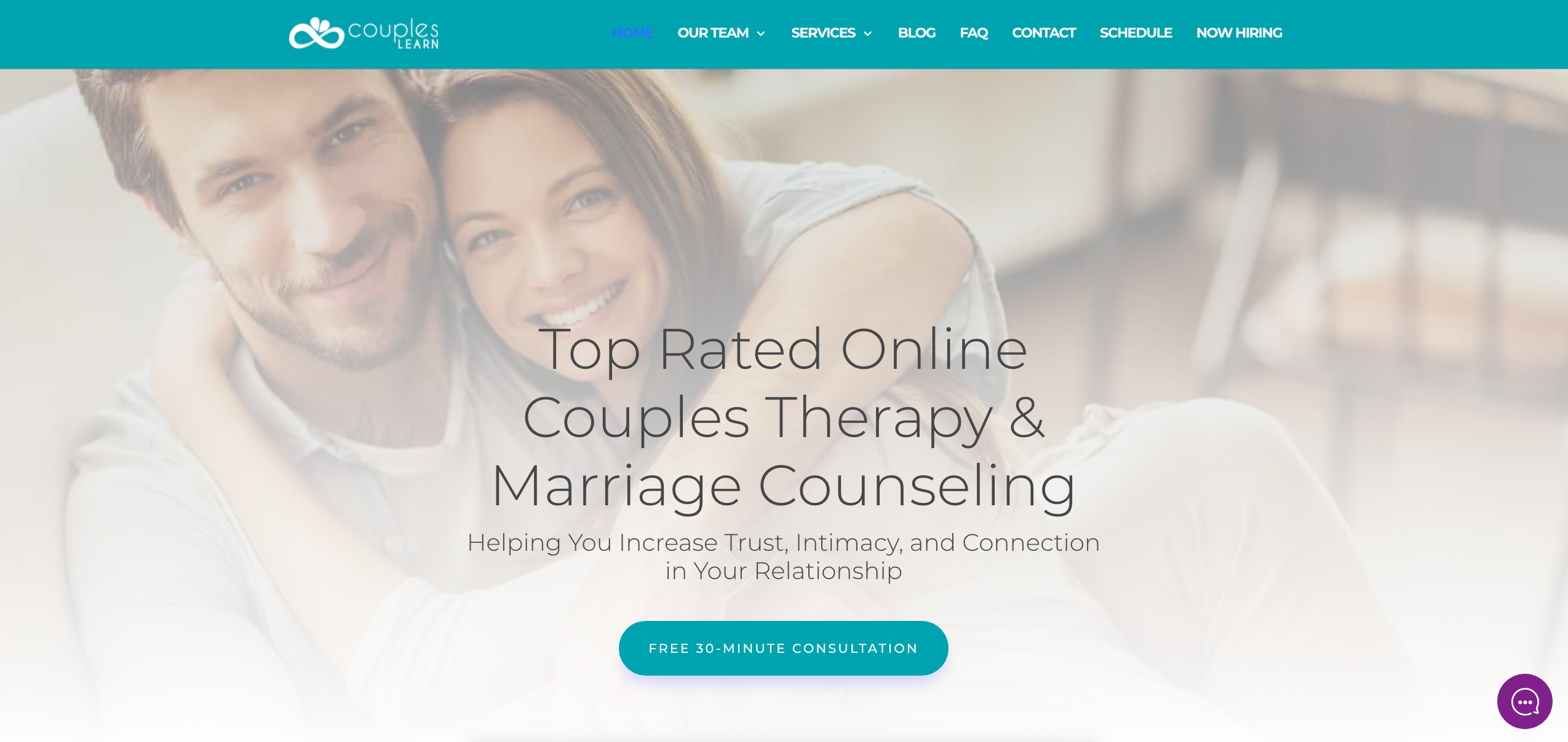
The overall feel of the Couples Learn website is pleasant and welcoming. The logo of a hugging couple transforming into an infinity sign is clever and catchy.
Want to know more about effectively marketing your private practice? Read about the top 18 ways to attract clients and upgrade your marketing skills now!
A clear message
Your website homepage should broadcast the main idea and usefulness of your business. Forty-six percent of visitors leave a website if they can’t tell what you do.
Above the fold, you should have a headline/business statement summing up what you do. A great working formula for a psychology business statement is Action + Target audience + Profit.
For example, “Helping anxious teen girls and young women feel confident and find their voice.”
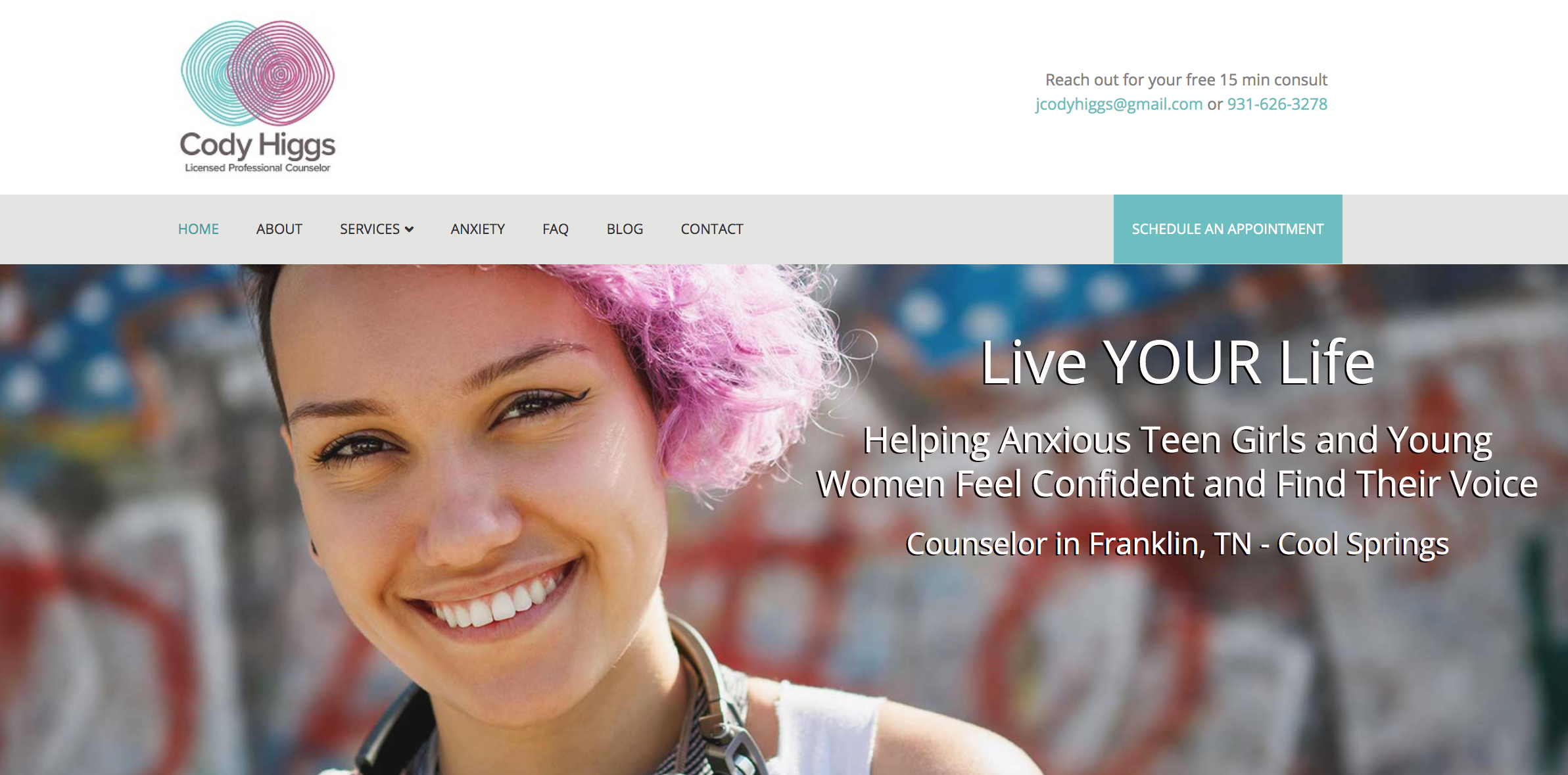
Make sure your headline or statement is at the top near your logo so it’s the first thing your website visitors see.
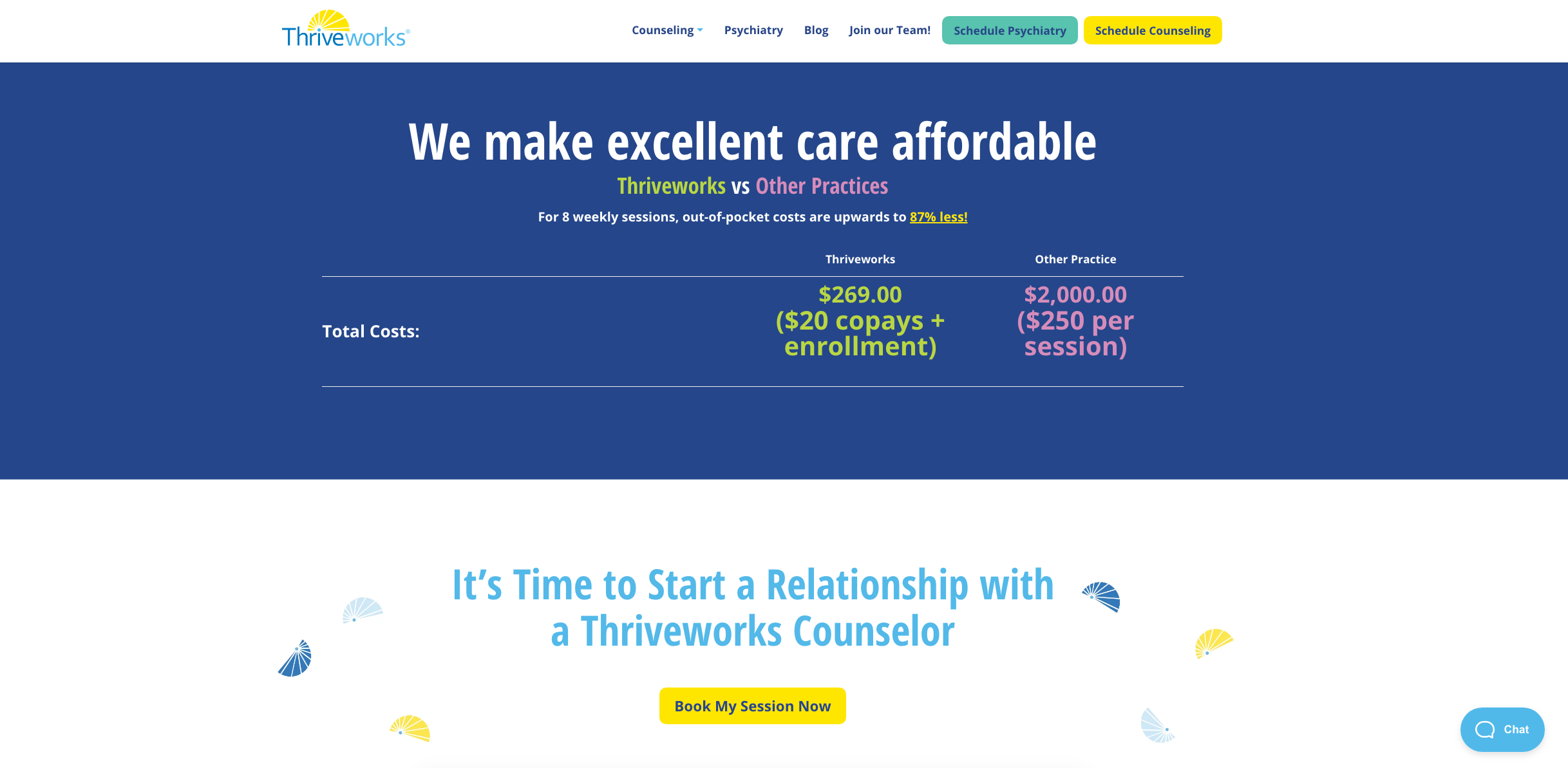
Another approach that helps convert visitors is creating a sense of urgency, such as by comparing your service with others, showing timers for products on sale, using bright colors, and running limited-time offers. Here is an example of how you can convert users into buyers if you sell any sort of products or bundle offers on your website:
Clear navigation
Your prospects come to your website to get answers, so make sure they can find answers quickly and easily. Unclear navigation can drive visitors away at record speed.

Another reason your website needs well-structured navigation is to help crawl robots understand it. Crawl robots, or web crawlers, are search engine bots that scan all the websites on the internet, survey/assess their contents, and index them so users can find the most relevant information. If a bot finds out that your website has confusing navigation, it will be hard to rank high in search engine results, so you’ll have fewer visitors and prospects.
Sometimes a simple navigation menu with comprehensive messages is all it takes to drastically boost conversions. Keep the number of buttons in the navigation to a minimum. For example, you might have Home, Services, Media, Blog, About me, and Contact me. Make sure the copy on each button clearly indicates what page it will guide the prospect to.
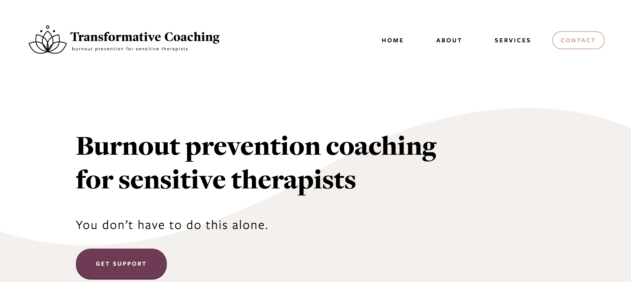
On Lydiaadamscoaching.com, there is a minimalist navigation bar with secondary elements underneath that guides visitors to all destinations they’re likely to visit.
Pro tip: Incorporate standard navigational elements, such as linking the logo to the home page, to reduce clicks.
Visual content
Appealing photos of you create the impression that it’s safe to work with you. Aside from ensuring flawless image and video quality, make sure the media on your site is relevant and illustrates what you offer. Don’t add photos of upbeat people just for the sake of it. Sometimes it’s better to have plain text on a neutral background. After all, people come to your site to find answers to their questions, so the website has to be appealing, light, and easy to read.
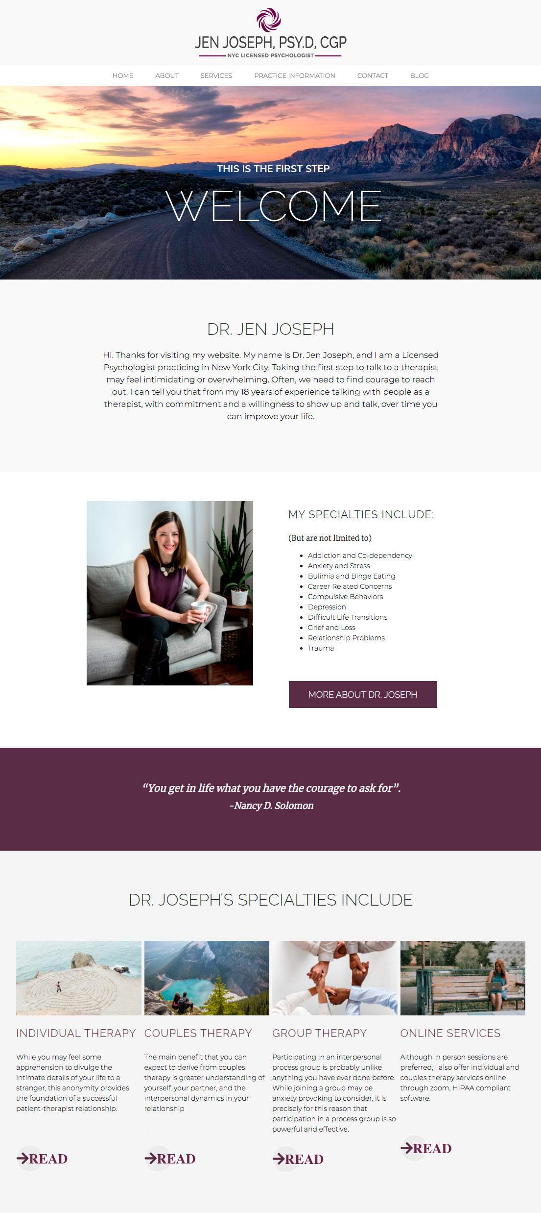
Below is a great example of a site where every image has its purpose and is related to the nearby text. Images don’t distract visitors from the content but rather help them visualize what the text is about and add to the ease of navigation.
If you sell products on your website — for instance, books — avoid distracting backgrounds on product photos and go for white. Also, make sure all images are the same size and enable zoom so your customers can see product details.
Additionally, think about adding security badges. Psychological health is still a sensitive issue, so your clients are likely concerned with the security of their data, privacy, and confidentiality. Using HIPAA-compliant software for holding video sessions can be another indicator of your credibility. ExpertBox can help you with secure video meetings. You can use ExpertBox software from anywhere on any device. It’s HIPAA-compliant and keeps your meetings secure with encrypted SSL connections.
Social proof
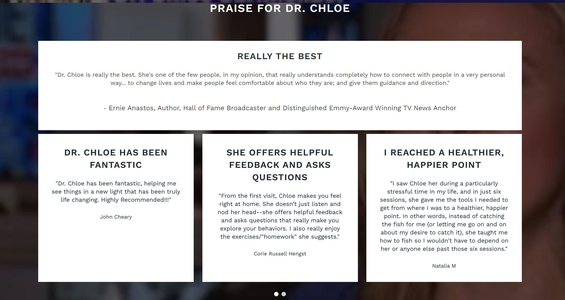
Social proof is a strong indicator that people trust you, which is why reviews drive conversions. However, soliciting reviews is considered unethical for healthcare professionals in the US, which is why therapists have to opt for other types of social proof. To show that you’re a professional, you can add the following types of social proof:
- Quotes from credible experts in your industry
- Media endorsements
- Quotes from third-party entities certifying you as a trustworthy source
Here’s how it’s done on Dr. Chloe’s website:
Learn more about how to use testimonials and market your private practice ethically in our psychologist’s guide to social networks.
Success Indicators
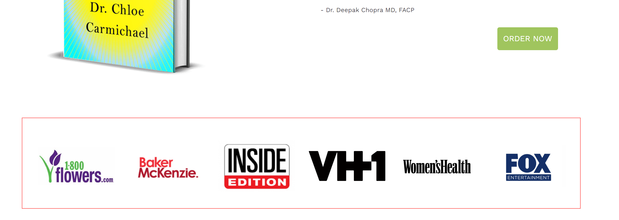
Have you got any awards, certificates, or letters of recognition? It’s time to show them to people. If you’re a host of TED talks or a TV show or are an invited author at a magazine or online media outlet, add the logos of the organizations you’re associated with to add credibility to your brand. It’s also a good idea to embed videos, like a featured TED lecture, on your website. As the saying goes, a picture is worth a thousand words.
For instance, when a visitor comes to the main page of drchloe.com, they see the logos of companies Dr. Chloe has worked with:
Website speed
Every second counts when converting prospects on your website. A slow website results in page abandonment.
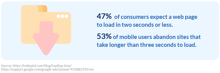
Since in the US 61% of visitors use mobile devices, it’s crucial to keep the page loading speed fast. To optimize your site for speed and performance, test it with Google PageSpeed Insights. It will analyze your website content and suggest improvements.
Key elements of a highly converting website
After you’ve ensured you have all the basic website elements working flawlessly, it’s time to optimize your website with killer features. Below is a list of the must-have elements of a highly converting website and how to use them.
Booking page
The ability to book a session with a psychologist without any extra actions is your unique selling proposition. A 2020 patient access journey report by Kyruus showed that 48% of patients prefer to schedule appointments by phone; however, 43% of patients now prefer to book online, and this percentage continues to rise each year.
If your clients need to call, send an email, or take any extra step to book a session, they’re more likely to leave your page. All such actions result in long hold times, robotic voices on the line, and endless back-and-forth communication, all of which are huge time wasters for your clients. A booking page allows clients to book appointments with you at any time without having to call you.

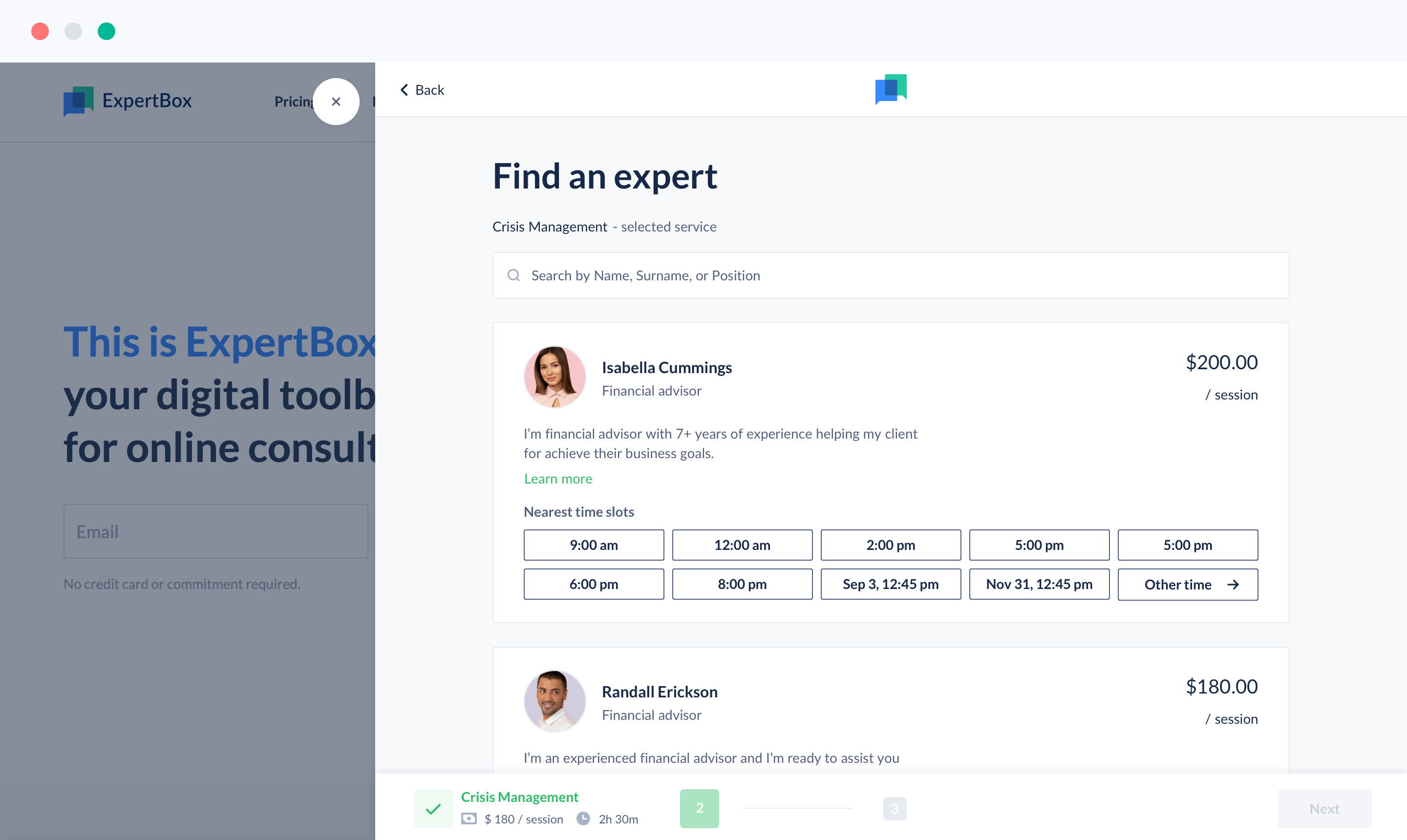
The ExpertBox booking page can help you attract website visitors without any hassle and right when they need you. It’s easy to add it to your website, customize the color, and choose the booking page position and a built-in payment system to be sure you’ll get paid in case of a no-show or cancellation.
CTA buttons
A clear call to action (CTA) is the driving force for your website. A CTA is an invitation to take a specific action. It’s one of the key elements that convert prospects into clients. Be clear with what action your prospects need to take or what they’ll receive as a result of clicking a button. For example, a CTA might be a button saying “Book a session now,” “Send me prices,” “Download a mental health checklist,” or “Join a webinar.” Never leave the standard “Click here” or “Learn more” text — it’s not informative and doesn’t motivate a user to take action.
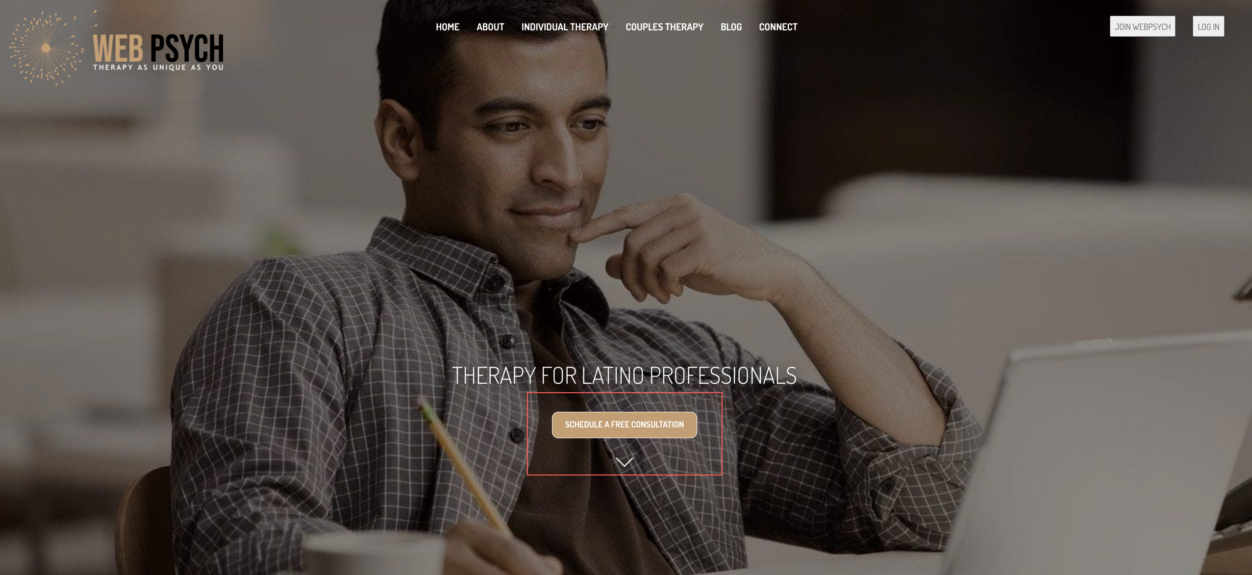
Depending on the location on your website and the purpose of a CTA button, you can link it to your contact form or to relevant content.
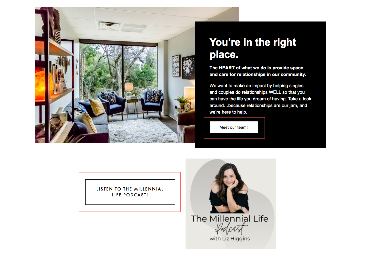
Pro tip: CTA buttons placed above the fold give better conversion rates since it’s harder for users to miss them.
Contact page and forms
Contact information and a contact form is the second most looked-for element on a website. Sixty-four percent of respondents to 2015 B2B Web Usability Report want to see contact information on a site. A visible link to the contact page helps establish credibility and trust.
Besides a contact page, you should have a contact form on every website page so your visitors can contact you whenever they need.
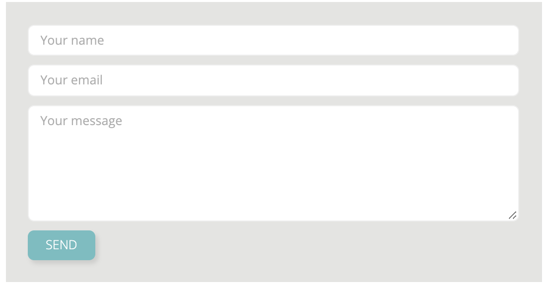
Keep in mind that excessive form field requirements can deter users from contacting you. A HubSpot study revealed that a three-field contact form can bring you 50% more form submissions than a four-field contact form.
Pro tip: In a form, only ask for information that you really need.
Pricing page
The pricing page is the second page your prospects are likely to look for. It’s also a highly converting element of a website since it has a huge impact on the purchasing decision. People want to be sure they can afford your service without having to double-check the price and bargain for a discount.
On the pricing page, you should clearly state the types of sessions you offer (individual and/or group), the length of sessions, the price per session, payment types and whether you provide superbills, whether you offer bundle discounts, what insurance providers you work with, how you accept online payments, etc. Don’t forget to set a clear refund policy to avoid misunderstandings.
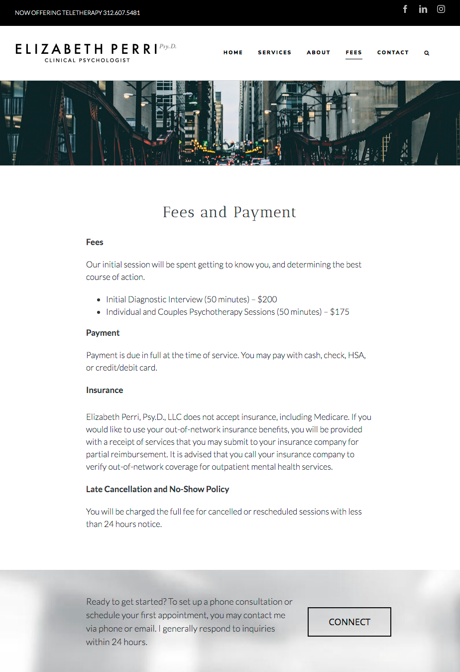
Above is a variant for organizing a pricing page. Visitors can see information about fees, payment types, insurance, and refund policies. What’s more, there’s a button with a CTA that encourages visitors to book a session.
FAQs
An ideal day for a psychologist is when they devote time to solving clients’ needs instead of answering logistical questions during sessions. An FAQ page on your website can help you reach perfection. Collect questions your clients always ask during your initial consultation and provide your answers there. If a prospect has a question while on the website, they can get an instant answer and dispel their concerns. This will increase the probability of a prospect booking a session rather than leaving your website in doubt.
An FAQ page can include all types of questions, from insurance-related questions to questions about the techniques you use, how to find your office, and what platform you use for video calls. An FAQ page saves you time during sessions and reduces clients’ fears of the unknown when starting sessions.
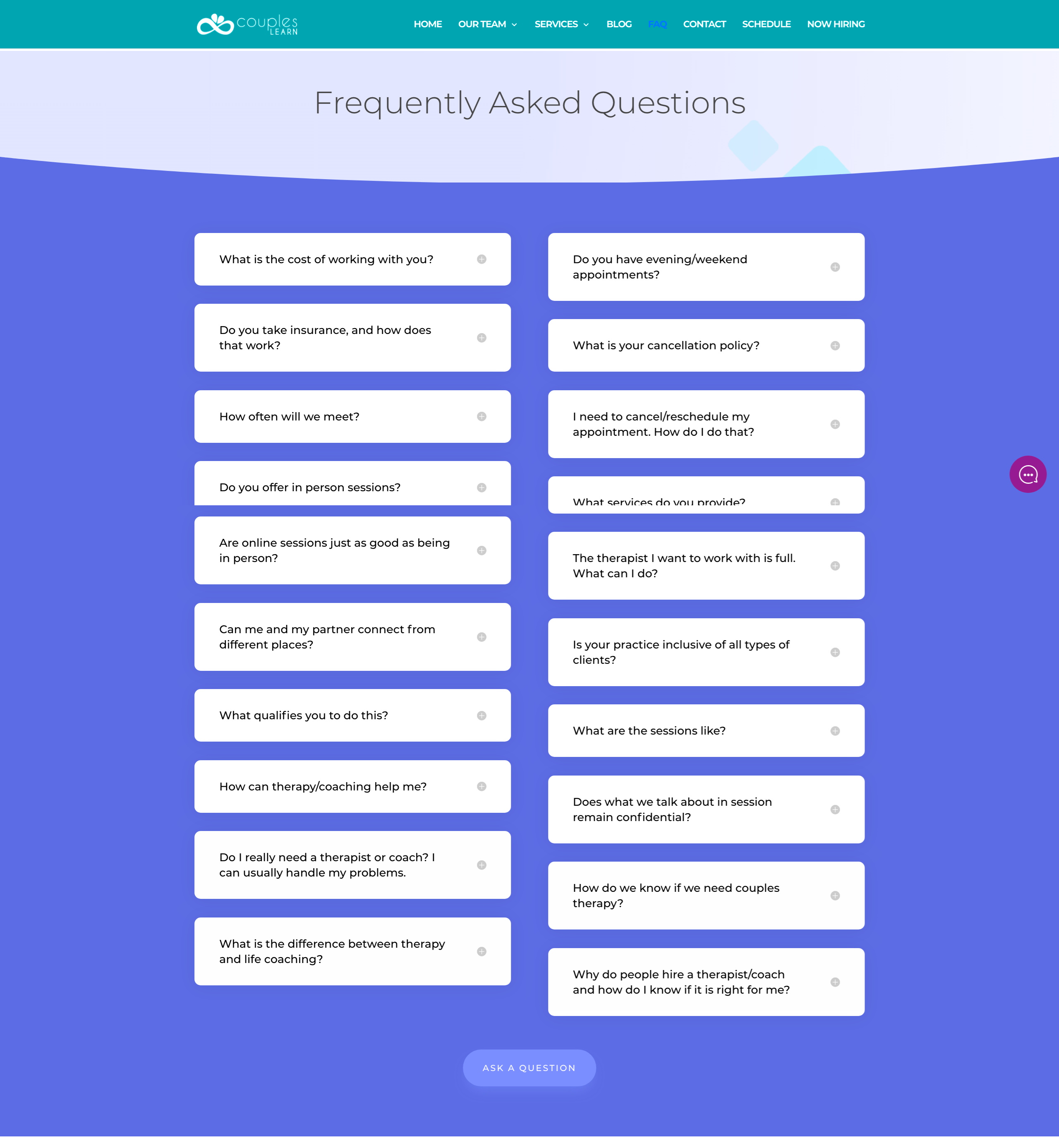
At the FAQ page of the coupleslearn.com website, there is a list of questions that may arise plus a form to ask about something that hasn’t been mentioned there, which is a big plus.
Live chat
Prospects often have a lot of questions and concerns when looking for a psychologist. A live chat can help you answer their questions and take a step towards sealing a deal. Being there whenever your clients need you is a huge advantage, making live chat an important element of any website. You can make the chat truly live by answering any questions yourself. As an alternative to a live chat, you can have a chatbot answer frequently asked questions.
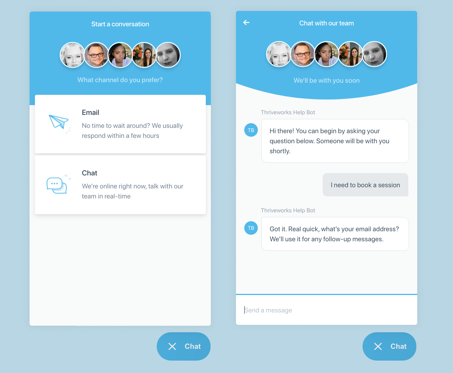
Think about it: Is someone more likely to purchase something from you if you respond to their question online or if their only option is to call you? If people have the option of typing or texting, they won’t be calling.
Summing up
A highly converting website is one with a combination of the features that work for you personally. The point is not to incorporate all possible features on one website but to create a path for prospects so they end up booking a session. Experiment with different website elements, measure their success, and optimize your website. We hope that our tips will get you off to a flying start.
For more insights on marketing your private practice, subscribe to our newsletter.
